Blog / Prompting
PromptingWhy Your AI Image Prompts Don't Give You What You Pictured
You wrote a careful description and got something else. Almost every version of this problem traces back to a single wrong assumption about how image models read text — and once you drop that assumption, most of your prompts get better immediately.
Here is the assumption: that the model reads your prompt the way a person reads a brief — top to bottom, building an understanding, weighing your requirements against each other, noticing which parts are essential and which are decoration.
It does not do that. It is closer to a very strong association engine: your words pull the picture toward regions of what it has seen, all at once and in parallel, with no notion of which of your requirements is the important one. Nearly every prompting frustration is a consequence of that difference.
1. Abstract quality words do almost nothing
Words like elegant, professional, high quality, beautiful, modern and stunning feel like they are giving direction. They are not, because they have no consistent appearance. There is no visual feature that all "professional" images share.
Compare:
| Vague | Renderable |
|---|---|
| A professional photo of an office | An empty open-plan office at dawn, low sun through floor-to-ceiling glass, long shadows across the desks |
| A beautiful mountain landscape | A granite ridge above the cloud line, late afternoon, one climber small against the rock face |
| A modern, elegant product shot | A matte black kettle on a pale concrete surface, single soft light from the left, deep shadow to the right |
The right-hand column is not longer for the sake of it — every added word names something that has an appearance: a time of day, a light direction, a surface, a spatial relationship. That is what the model can act on.
If you cannot point at the thing in a photograph, the model cannot draw it.
2. Longer is not better — attention is a fixed budget
There is a strong instinct to keep adding words when a result disappoints. It usually makes things worse. Everything in your prompt competes for the same finite influence, so a hundred-word prompt gives each word roughly a third of the pull it would have had in a thirty-word one.
This is why prompts that end in a long tail of comma-separated adjectives — detailed, sharp, 8k, masterpiece, award winning, trending — often produce less controlled images than the same prompt without them. The decoration is not free; it is spending the budget your actual subject needed.
A practical test
Take your prompt and delete every word that is not a thing, a place, a material, a light condition or a spatial relationship. If the image gets better, the deleted words were noise. This is true more often than people expect.
3. Negatives don't work the way you'd hope
Writing "no text", "without people", or "not blurry" inside your main description tends to backfire, because the concept is present in the text regardless of the word attached to it. Naming a thing in order to exclude it still puts it in the room.
Where a separate negative field exists, that is the correct place for exclusions — it is handled differently from your description rather than being read as part of it. Where it doesn't, the reliable move is to describe what should be there instead. "An empty beach at sunrise" outperforms "a beach with no people" almost every time.
4. Anything that implies time or movement is wasted
A still image has no before and no after. These all fail for the same reason:
- "The camera slowly pans across the workshop"
- "She turns to look at the door"
- "Before and after the renovation"
- "The bird takes off from the branch"
Each describes a change, and a single frame can only show one state. What you get is an arbitrary point in that change — often the least interesting one.
The fix is to name the instant you actually want, and to pick one that carries the implication of movement without needing it: the bird crouched with wings half-open, the dust still hanging in the workshop light, her hand already on the door frame. A frozen moment can absolutely convey motion. It just has to be a specific frozen moment.
5. Your prompt has a foreground and a background, whether you meant it or not
Word order carries weight. Concepts near the start tend to dominate. A prompt that begins with the setting and mentions the subject at the end will often return a beautiful setting with a subject that seems incidental — because that is, structurally, what you asked for.
A dependable ordering:
- Subject — the thing the image is of
- Action or state — what it is doing, frozen
- Setting — where, and what surrounds it
- Light — direction, time of day, quality
- Framing — close, wide, overhead, eye level
- Medium — photograph, illustration, painting
You do not need all six every time. But if the subject keeps getting lost, check whether you buried it in position four.
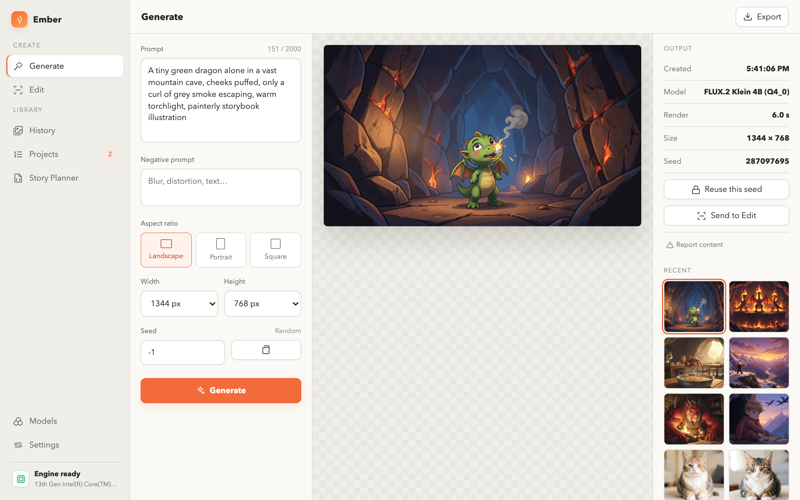
6. The same prompt gives different images — and that's controllable
Generation starts from random noise and gradually resolves it into a picture. Different starting noise, different picture, even with identical words. That randomness is usually described as a seed.
This matters more than it first appears, because it separates two questions that people constantly confuse:
- Is my prompt wrong? — change the seed. If several seeds all give you the same problem, the prompt is the problem.
- Is this seed unlucky? — keep the prompt, run it again. If the other results are fine, you simply hit a bad draw.
Fixing the seed and changing one word at a time is the only way to learn what a given word actually does. Change two things at once and you have learned nothing about either.
7. Proportions change the composition, not just the crop
Asking for a wide 16:9 frame does not simply crop a square image. It changes what fits, and therefore what the model composes: landscape shapes tend to place the subject in a context, tall 9:16 shapes tend to fill with the subject itself. If you want a portrait to feel spacious, a wide frame will fight you. Choose the proportions before you spend time tuning words.
The short version
- Replace quality adjectives with things that have an appearance.
- Shorter, more specific prompts beat long ones — attention is finite.
- Describe what should be there, not what shouldn't.
- Never describe movement or a before-and-after in a single frame.
- Lead with the subject; buried subjects come out incidental.
- Fix the seed and change one word at a time when diagnosing.
- Pick the aspect ratio first — it changes the composition itself.
Frequently asked questions
Why does the image ignore part of my prompt?
Usually because that part is competing with something stronger in the same prompt, or because it names an abstract quality rather than a visible thing. Try removing the competing element to confirm which one is winning.
Do longer prompts produce better images?
No. Past a point, extra words dilute the ones that matter, since influence is shared across everything you wrote. A precise thirty-word description usually beats a hundred-word pile of adjectives.
Why do I get a different image from the same prompt?
Generation starts from random noise and the starting point differs each run. Reusing a fixed seed reuses that starting point, which is how a set of images is kept visually consistent.
Should I use words like "8k", "masterpiece" or "award winning"?
They are mostly cargo cult. They spend part of a fixed attention budget without naming anything renderable. Test it directly: run your prompt with and without the tail, same seed, and compare.
How do I keep a set of images looking consistent?
Hold constant everything you can — the same seed, the same phrasing for style and light, the same aspect ratio — and vary only the subject line. A set breaks up visually when the light direction or medium drifts between shots.
Try it where every setting stays visible
Ember runs on your own machine and records the prompt, size, seed and model behind every picture — so you can change one thing at a time and see what it actually did.